Normality Tests in Statistics: Top Methods and Tools for Reliable Data Analysis
When conducting data analysis, have you ever felt puzzled that although every step seemed correct, the results still looked unreliable? In many cases, the root cause lies in ignoring one crucial prerequisite—whether the data follow a normal distribution.
Most widely used statistical techniques, such as t-tests, analysis of variance (ANOVA), and regression analysis, are built on the assumption of normality. If this assumption is violated, the conclusions may easily deviate. In this article, we will explain step by step how to quickly determine whether data are normally distributed and which tools are most convenient to apply.
Overview of Normality Testing Methods
Normality testing methods can generally be classified into three categories: graphical methods, descriptive statistics, and statistical hypothesis tests.
- Graphical methods provide a visual judgment, such as histograms, Q-Q plots, and P-P plots.
- Descriptive statistics evaluate normality by calculating skewness and kurtosis.
- Statistical tests offer quantitative judgments, such as the Shapiro-Wilk test and the Kolmogorov-Smirnov test.
Each approach has strengths and limitations, so combining them often yields the most reliable results.
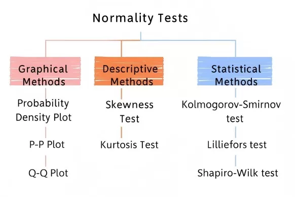
Normality Tests Overview: Graphical, Descriptive, Statistical
Choosing the Right Normality Test Based on Sample Size
- n ≤ 50: Shapiro-Wilk test
- 50 < n < 5,000: Shapiro-Wilk or Anderson-Darling test
- n ≥ 5,000: Graphical methods + skewness and kurtosis analysis (since in large datasets even slight deviations are judged significant)
Three Categories of Normality Testing
1. Visual Assessment: Graphical Methods
The distribution shape of data often reveals key information. These three visualization techniques provide quick insights into whether data approximate a normal distribution.
a) Histogram: Inspecting Distribution Shape
By dividing data into groups and plotting a histogram, a symmetric bell-shaped curve with higher frequencies in the center and lower at both ends often suggests normality. Typical examples include variables such as height or IQ. However, if the histogram shows obvious skewness (e.g., income data, where most values are low with a few very high outliers leading to right skewness), this signals a deviation from normality.
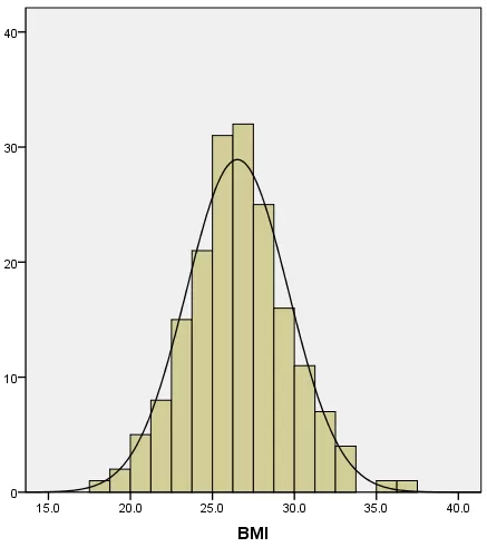
BMI Histogram with Fitted Normal Curve
b) Q-Q Plot: Checking Quantile Alignment
The quantile–quantile (Q-Q) plot compares sample quantiles with theoretical quantiles from a normal distribution. If the points align closely along a straight diagonal line, the data are likely normal. Substantial deviations, such as S-shaped or bow-shaped patterns, indicate non-normality.
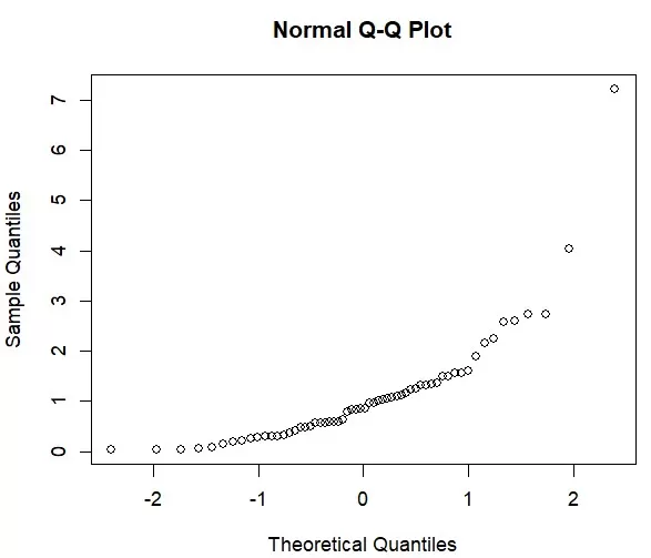
Normal Q–Q Plot Showing Right-Tail Deviation
c) P-P Plot: Assessing Cumulative Probability Fit
The probability–probability (P-P) plot compares cumulative probabilities of the data with those of a normal distribution. Points clustering around the diagonal suggest good normality. However, when extreme values exist, the Q-Q plot is typically more robust, making it the preferred method in practice.
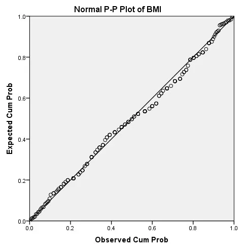
Normal P–P Plot of BMI — Good Fit
2. Quantitative Validation: Statistical Test Methods
For analysts who find graphical approaches too subjective, statistical tests provide objective, numerical evidence of normality.
a) Shapiro-Wilk Test: Best for Small Samples
When sample size is below 50, this test is particularly reliable. The test statistic (W) ranges between 0 and 1, with values closer to 1 indicating stronger normality. The decision rule is straightforward: if p > 0.05 (with 0.05 as the standard significance threshold), normality can be assumed.
b) Kolmogorov-Smirnov Test: Suitable for Larger Samples
When sample size is ≧ 50, the K-S test is often used. It measures the maximum difference (D statistic) between the sample’s cumulative distribution and the theoretical normal distribution. Smaller D values suggest a better fit. However, this test is sensitive to large sample sizes and may reject normality even when deviations are minimal.
c) Anderson-Darling Test: Sensitive to Tails
An enhancement of the K-S test, the Anderson-Darling test gives more weight to differences in distribution tails. It is applicable across all sample sizes. A smaller A² statistic indicates stronger conformity to normality.
Comparison Table: Major Normality Statistical Test Methods
|
Test Method |
Optimal Sample Size |
Detection Focus |
Distribution Parameters |
Python Function |
Recommended Use Case |
|
Shapiro-Wilk |
n ≤ 50 |
Overall deviations |
Not required |
scipy.stats.shapiro |
Small samples, comprehensive check |
|
Kolmogorov-Smirnov |
n > 50 |
Distribution shape |
Required |
scipy.stats.kstest |
Large samples, parameter comparison |
|
Anderson-Darling |
All sample sizes |
Tail differences |
Estimated from data |
scipy.stats.anderson |
Reliability analysis, tail sensitivity |
3. Descriptive Statistical Indicators: Skewness and Kurtosis
Another practical approach is to evaluate skewness and kurtosis.
Skewness measures distribution symmetry. A normal distribution has skewness of 0. Positive skewness indicates right skew; negative skewness indicates left skew.
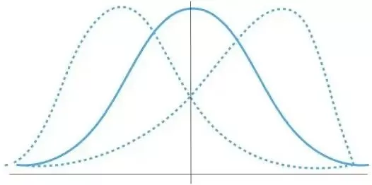
Skewness Explained: Left-Skewed vs Right-Skewed vs Normal
Kurtosis measures the “peakedness” of the distribution. Under one definition, normal distribution kurtosis = 0 (or = 3 in an alternative definition). Positive kurtosis reflects a sharper peak; negative kurtosis reflects a flatter peak.
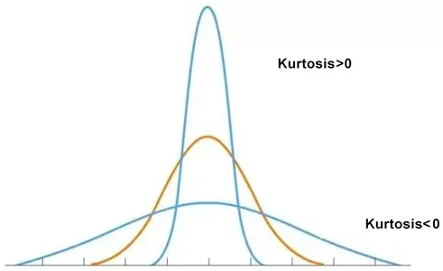
Kurtosis Illustration: Leptokurtic vs Platykurtic
By calculating Z-scores, if |Z| < 1.96 (95% confidence interval), the distribution can be considered consistent with normality.
Recommended Tools for Normality Testing
Carrying out normality tests does not require manual formula writing. The following tools allow easy implementation:
1. Python (Scipy library)
A preferred choice for programmers. Use shapiro() for Shapiro-Wilk, kstest() for K-S, and anderson() for Anderson-Darling—all with just a few lines of code.
Shapiro-Wilk:
from scipy.stats import shapiro
stat, p = shapiro(data)
print(f'Statistics={stat:.3f}, p={p:.3f}')
Kolmogorov-Smirnov Test:
from scipy.stats import kstest
stat, p = kstest(data, 'norm', args=(np.mean(data), np.std(data)))
Anderson-Darling Test:
from scipy.stats import anderson
result = anderson(data)
print(f'Statistic={result.statistic:.3f}')
2. R Language
Functions such as shapiro.test(), ks.test(), and plotting functions like qqnorm() make statistical testing and visualization straightforward.
3. SPSS
For non-programmers, SPSS provides menu-driven options. Navigate through:
- Analyze → Descriptive Statistics → Explore for Q-Q plots, skewness, and kurtosis.
- Analyze → Nonparametric Tests → Legacy Dialogs → 1-Sample K-S for the Kolmogorov-Smirnov test.
Taking the Kolmogorov–Smirnov method as an example, the K-S test can be implemented through the nonparametric test path:
Select Analyze → Nonparametric Tests → Legacy Dialogs → 1-Sample K-S.
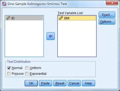
SPSS Setup for Kolmogorov–Smirnov Normality Test
Add BMI to the Test Variable List, check Normal in the Test Distribution box, and click OK to complete the operation
Common Pitfalls in Normality Testing
- Impact of sample size: Graphical methods are often more intuitive with small datasets, while statistical tests such as K-S may be overly strict for large samples.
- Accepting approximate normality: Many statistical methods tolerate minor deviations from normality, and for large samples, the Central Limit Theorem provides additional robustness.
- Combining methods: A combination of graphical inspection (e.g., Q-Q plots) with statistical tests (e.g., Shapiro-Wilk) provides more reliable conclusions.
Conclusion: The Importance of Normality Testing in Data Analysis
Normality testing serves as a pre-check in data analysis, ensuring that subsequent statistical tests and models produce valid and reliable results. By mastering graphical methods, statistical tests, and descriptive statistics, analysts can make well-informed decisions and avoid misleading conclusions. Next time you work with data, apply these methods and tools to enhance the credibility and accuracy of your findings.
Read more
- Omics Data Processing Series
- Omics Data Analysis Series
- Metabolomics Batch Effects
- Metabolomic Analyses: Comparison of PCA, PLS-DA and OPLS-DA
- WGCNA Explained: Everything You Need to Know
- Beginner for KEGG Pathway Analysis: The Complete Guide
- GSEA Enrichment Analysis: A Quick Guide to Understanding and Applying Gene Set Enrichment Analysis
- Comparative Analysis of Venn Diagrams and UpSetR in Omics Data Visualization
Next-Generation Omics Solutions:
Proteomics & Metabolomics
Ready to get started? Submit your inquiry or contact us at support-global@metwarebio.com.


