Volcano Plots in Metabolomics & Proteomics: Interpretation, Cutoffs, and Best Practices
Volcano plots are a compact way to visualize differential analysis results across thousands of metabolites or proteins. By combining effect size (log₂ fold change) and statistical evidence (−log₁₀ p or q), they surface variables with large, reliable differences between conditions—ideal for screening candidates, generating pathway hypotheses, and communicating results in figures.
What Is a Volcano Plot
A volcano plot is a scatter plot where each point represents a measured feature (e.g., a metabolite or protein) and how its abundance differs between two groups.
- x-axis (log₂ fold change): magnitude and direction of change (right = upregulated; left = downregulated).
- y-axis (−log₁₀ p or q): statistical significance (higher = stronger evidence after testing).
Features with both large effect size and strong statistical support tend to appear in the upper-right (upregulated) or upper-left (downregulated) regions.
How to Interpret: Axes, Cutoffs, and Significant Regions
Locate the center (log₂FC ≈ 0). Variables near zero show little change.
Scan vertically. Higher points indicate stronger statistical evidence (smaller p/q).
Scan horizontally. Points farther from zero indicate larger effect sizes.
Combine both. Upper-left/upper-right areas often contain the most promising candidates.
Check direction. Right = higher in the test group; left = lower.
Common cutoffs (example):
- Effect size: |log₂FC| ≥ 1 (≈ 2-fold)
- Significance: q < 0.05 (Benjamini–Hochberg FDR)
On the plot, draw a horizontal line at −log₁₀(q cutoff) and vertical lines at the log₂FC cutoffs. Predefine thresholds in your analysis plan and keep them consistent across figures.
Key Statistics Behind Volcano Plots
Fold change (FC) and log₂FC: report both direction and magnitude; log scaling centers symmetry around 0.
p-value vs. q-value: use q-values (FDR-adjusted) for ranking and on-figure thresholds to control false positives under multiple testing.
Effect size & confidence: statistical significance alone can be misleading with large n. Consider reporting effect sizes with CIs where appropriate.
Multiple testing: control via Benjamini–Hochberg (or alternatives suited to the design).
Dependencies for meaningful interpretation: adequate normalization, batch correction, appropriate imputation for missing values, and a design with sufficient power.
Customization & Annotation for Better Insight
Color coding: Distinguish significant up/down features (e.g., warm vs. cool tones). For accessibility, consider color-blind-safe palettes and/or shape/opacity cues.
Annotations: Label sentinel metabolites/proteins (top by |log₂FC| and q) and provide tooltips in interactive views.
Consistent styling: Standardize axis labels, legends, title conventions, and threshold lines across figures.
Export options: Prepare both raster (PNG) for web and vector (PDF/SVG) for publication.
Common Pitfalls & QC Checklist
Frequent issues
- Small sample sizes inflate variance and destabilize p/q estimates.
- Inadequate normalization or unaddressed batch effects distort both FC and significance.
- Imputation choices (e.g., constant/LOD imputation) can bias log₂FC—document methods.
- Threshold hacking: altering cutoffs post hoc to “catch” favorites undermines reproducibility.
- Over-reliance on p without considering biological relevance and effect size.
- Small-n and imbalanced designs. With few replicates, variance estimates are unstable and q-values can swing. Use variance-moderating models, assess power where possible, avoid aggressive imputation, and prefer conservative FDR. For imbalanced groups, check leverage and consider precision weights; verify findings with sensitivity analyses and, ideally, external validation.
QC checklist (use before plotting)
- Assess signal drift and apply QC-based normalization if applicable.
- Evaluate batch effects (e.g., PCA trends) and correct (e.g., ComBat, RUV).
- Decide on imputation strategy consistent with data missingness mechanism.
- Pre-register cutoffs and statistical model; document n, covariates, and contrasts.
- Confirm FDR control and report both q-values and effect sizes.
Volcano vs MA vs Manhattan vs VIP–FC
Note: A standard volcano plot uses −log₁₀(p or q) on the y-axis. VIP–FC (PLS-DA) scatter is a separate visualization for model-based variable ranking and should not be labeled a volcano plot.
|
Plot |
Best for |
Axes |
Strengths |
Limitations |
Typical keywords |
|
Volcano plot |
Two-group differential analysis in metabolomics/proteomics |
x = log₂FC; y = −log₁₀(p or q) |
Intuitive “magnitude + significance”; fast hit prioritization |
Univariate focus; requires proper FDR control |
volcano plot metabolomics, proteomics volcano plot, fold change vs p-value, adjusted p-value |
|
MA plot |
Intensity-dependent effects & QC |
x = mean abundance (A); y = log₂FC (M) |
Reveals intensity bias; complements normalization checks |
No direct p/q view; must pair with stats |
MA plot vs volcano, mean-difference plot, intensity bias |
|
Manhattan plot |
GWAS/association scans |
x = genomic position; y = −log₁₀(p) |
Genome-wide view across loci |
Not for fold change; domain-specific |
Manhattan vs volcano, GWAS visualization |
|
VIP–FC scatter |
Variable ranking from PLS-DA |
x = log₂FC; y = VIP |
Highlights model-important variables |
Model-dependent; not a volcano plot |
VIP vs p-value, PLS-DA VIP |
Applications in Omics: From Screening to Pathway Hypotheses
Volcano plots help triage features into upregulated (upper-right), downregulated (upper-left), and not significant (bottom center), streamlining:
- Biomarker screening and candidate selection
- Pathway hypothesis generation and enrichment (e.g., KEGG, GO)
- Panel building for downstream verification (e.g., PRM/SRM, targeted metabolomics)
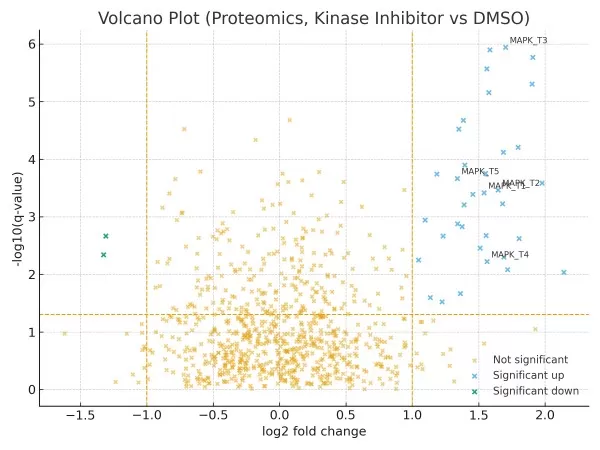
Micro-case 1 (Proteomics, Drug Treatment).
A kinase inhibitor vs. DMSO in a cancer cell line (balanced replicates). With normalization and FDR at q<0.05, ~30 phosphoproteins with |log₂FC|>1 cluster in the right arm and enrich MAPK signaling. Five sentinel targets are annotated; follow-up PRM prioritizes four for verification. Pathway analysis suggests MAPK suppression with compensatory PI3K activity.

Figure 1. Volcano plot (proteomics, kinase inhibitor vs DMSO). Points show log₂ fold change vs −log₁₀(q-value). Vertical lines: |log₂FC| = 1; horizontal line: q = 0.05. Sentinel phosphoproteins in the right arm are annotated; candidates enrich MAPK signaling.
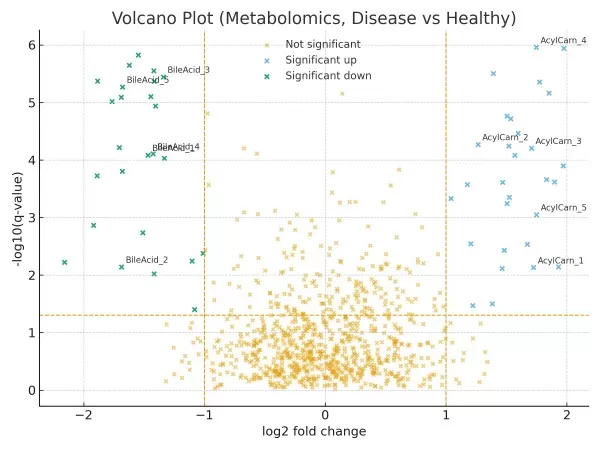
Micro-case 2 (Metabolomics, Disease vs. Healthy).
Untargeted plasma profiling indicates a left-arm cluster of bile acid conjugates (lower in cases) and a right-arm group of acylcarnitines (higher in cases). A three-metabolite panel reaches cross-validated AUC ≈ 0.87 (external validation recommended). Enrichment points to β-oxidation and bile acid metabolism for follow-up.

Figure 2. Volcano plot (metabolomics, disease vs healthy). Left arm highlights downregulated bile-acid conjugates; right arm highlights upregulated acylcarnitines. Thresholds: |log₂FC| = 1; q = 0.05.
Frequently Asked Questions
Q1: What does a volcano plot show in metabolomics?
A: It visualizes which metabolites differ between groups by combining log₂FC (magnitude/direction) and −log₁₀ p/q (evidence), helping prioritize biologically relevant changes.
Q2: What thresholds should I use?
A: A common starting point is |log₂FC| ≥ 1 and q < 0.05, but adjust based on study goals, sample size, expected effect sizes, and validation plans.
Q3: Should I use p or q on the y-axis?
A: Prefer q-values to reflect multiple-testing control; report both when space allows.
Q4: How does a volcano plot help in proteomics?
A: It highlights proteins with large, statistically supported changes across conditions, accelerating target triage for verification (e.g., PRM/SRM) and pathway analysis.
Q5: What sample size is reasonable?
A: There is no one-size-fits-all. Use power calculations where possible; designs with adequate replicates and batch control yield more stable effect sizes and q-values.
Volcano plots offer an intuitive, statistically grounded lens for discovering meaningful changes in large-scale omics datasets. When coupled with proper normalization, FDR control, and effect-size reporting—and complemented by MA plots, PCA/PLS-DA, and enrichment—they provide a solid bridge from visualization to biological insight.
Try it in Metware Cloud: import data, set FC/q cutoffs, annotate key features, and export publication-ready figures in minutes. Contact our team for guidance on normalization, batch correction, or downstream pathway analysis.
Read more
- Omics Data Analysis Series
- Metabolomics Batch Effects
- Understanding WGCNA Analysis in Publications
- Deciphering PCA: Unveiling Multivariate Insights in Omics Data Analysis
- Metabolomic Analyses: Comparison of PCA, PLS-DA and OPLS-DA
- WGCNA Explained: Everything You Need to Know
- Harnessing the Power of WGCNA Analysis in Multi-Omics Data
- Beginner for KEGG Pathway Analysis: The Complete Guide
- GSEA Enrichment Analysis: A Quick Guide to Understanding and Applying Gene Set Enrichment Analysis
Next-Generation Omics Solutions:
Proteomics & Metabolomics
Ready to get started? Submit your inquiry or contact us at support-global@metwarebio.com.


